
已经了解 Vue 2,只想了解 Vue 3 的新功能可以参阅vue3新功能!
已经有 Vue 2项目,需要适配 Vue 3 的可参阅vue2 项目迁移 vue3!
<template>,这个 <template> 下在App、H5可以有多个根 <view> 组件,在小程序只能有一个根 <view> 组件。下面是一个基本组件示例,在根<view>组件下再次引入一个<view>组件,并给组件的text区绑定一个data。
	<template>
		<view>
			<text>{{userName}}</text>
		</view>
	</template>
	<script>
		export default {
			data() {
				return {
					"userName":"foo"
				}
			}
		}
	</script>
基础组件是内置在uni-app框架中的,包括view、text、input、button、video等几十个基础组件,列表详见:uni-app基础组件
但仅有基础组件是不够用的,实际开发中会有很多封装的组件。
比如我们需要一个五角星点击评分的组件,在DCloud的插件市场里可以获取到:https://ext.dcloud.net.cn/plugin?id=33
把这个uni-rate组件导入到你的uni-app项目下,在需要的vue页面里引用它,就可以在指定的地方显示出这个五角星组件。
	<!-- 在index.vue页面引用 uni-rate 组件-->
	<template>
		<view>
			<uni-rate></uni-rate><!-- 这里会显示一个五角星,并且点击后会自动亮星 -->
		</view>
	</template>
在注册一个组件的时候,我们始终需要给它一个名字。 定义组件名的方式有两种:
当使用 kebab-case (短横线分隔命名) 定义一个组件时,你也必须在引用这个自定义元素时使用 kebab-case,例如 <my-component-name>。
当使用 PascalCase (首字母大写命名) 定义一个组件时,你在引用这个自定义元素时两种命名法都可以使用。
也就是说 <my-component-name> 和 <MyComponentName> 都是可接受的。
在uni-app工程根目录下的 components 目录,创建并存放自定义组件:
	│─components            	符合vue组件规范的uni-app组件目录
	│  └─componentA         	符合‘components/组件名称/组件名称.vue’目录结构,easycom方式可直接使用组件
	│  		└─componentA.vue    可复用的componentA组件
	│  └─component-a.vue      可复用的component-a组件
uni-app 支持配置全局组件,需在 main.js 里进行全局注册,注册后就可在所有页面里使用该组件。
注意
main.js 里进行全局导入和注册 import App from './App'
import {createSSRApp} from 'vue'
//引入组件
import myComponent from './components/my-component/my-component.vue'
export function createApp() {
const app = createSSRApp(App)
//调用app.component方法全局注册组件
app.component('my-component', myComponent)
return {
app
}
}
index.vue 里可直接使用组件 <template>
<view>
<my-component></my-component>
</view>
</template>
局部注册之前,在需要引用该组件的页面,导入你想使用的组件。
页面引入组件方式
如下通过两种方式导入一个角标的组件库,详见,推荐使用 easycom 方式引入。
import 方式引入组件 ,在 components 选项中定义你想要使用的组件。 <!-- 在index.vue引入 uni-badge 组件-->
<template>
<view>
<uni-badge text="1"></uni-badge><!-- 3.使用组件 -->
</view>
</template>
<script>
import uniBadge from '@/components/uni-badge/uni-badge.vue';//1.导入组件(这步属于传统vue规范,但在uni-app的easycom下可以省略这步)
export default {
components:{uniBadge }//2.注册组件(这步属于传统vue规范,但在uni-app的easycom下可以省略这步)
}
</script>
对于 components 对象中的每个 property 来说,其 property 名就是自定义元素的名字,其 property 值就是这个组件的选项对象。
在对象中放一个类似 uniBadge 的变量名其实是 uniBadge : uniBadge 的缩写,即这个变量名同时是:
components 目录下,并符合 components/组件名称/组件名称.vue 目录结构。就可以不用引用、注册,直接在页面中使用。 <!-- 在index.vue引入 uni-badge 组件-->
<template>
<view>
<uni-badge text="1"></uni-badge><!-- 3.使用组件 -->
</view>
</template>
<script>
// 这里不用import引入,也不需要在components内注册uni-badge组件。template里就可以直接用
export default {
data() {
return {
}
}
}
</script>
easycom是自动开启的,不需要手动开启,有需求时可以在 pages.json 的 easycom 节点进行个性化设置,详见。
不管components目录下安装了多少组件,easycom打包后会自动剔除没有使用的组件,对组件库的使用尤为友好。
组件是 vue 技术中非常重要的部分,组件使得与ui相关的轮子可以方便的制造和共享,进而使得 vue 使用者的开发效率大幅提升。
uni-app 搭建了组件的插件市场,有很多现成的组件,若下载符合components/组件名称/组件名称.vue目录结构的组件,均可直接使用。uni-app插件市场
uni-app只支持 vue单文件组件(.vue 组件)。其他的诸如:动态组件,自定义render,和<script type="text/x-template">字符串模版等,在非H5端不支持。
props 可以是数组或对象,用于接收来自父组件的数据。props 可以是简单的数组,或者使用对象作为替代,对象允许配置高级选项,如类型检测、自定义验证和设置默认值。
| 选项 | 类型 | 说明 |
|---|---|---|
| type | String 、 Number 、 Boolean 、 Array 、 Object 、 Date 、 Function 、 Symbol ,任何自定义构造函数、或上述内容组成的数组 | 会检查一个 prop 是否是给定的类型,否则抛出警告,复杂数据类型需要通过 PropType 标记类型,详见。 |
| default | any | 为该 prop 指定一个默认值。如果该 prop 没有被传入,则换做用这个值。对象或数组的默认值必须从一个工厂函数返回。 |
| required | Boolean | 定义该 prop 是否是必填项。 |
| validator | Function | 自定义验证函数会将该 prop 的值作为唯一的参数代入。在非生产环境下,如果该函数返回一个 false 的值 (也就是验证失败),一个控制台警告将会被抛出。 |
	<template>
		<view>
			<!-- 我是子组件componentA -->
			<view>{{age}}</view>
		</view>
	</template>
	<script>
		export default {
			props: {
				// 检测类型 + 其他验证
				age: {
					type: Number,
					default: 0,
					required: true,
					validator: function(value) {
						return value >= 0
					}
				}
			}
		}
	</script>
	<template>
		<view>
			<!-- 我是父组件 -->
			<componentA :age="10"></componentA>
		</view>
	</template>
prop 传入一个静态的值: <blog-post title="My journey with Vue"></blog-post>
v-bind 或简写 : 动态赋值,例如: <!-- 动态赋予一个变量的值 -->
<blog-post :title="post.title"></blog-post>
<!-- 动态赋予一个复杂表达式的值 -->
<blog-post :title="post.title + ' by ' + post.author.name"></blog-post>
在上述两个示例中,我们传入的值都是字符串类型的,但实际上任何类型的值都可以传给一个 prop。
	<!-- 即便 `42` 是静态的,我们仍然需要 `v-bind` 来告诉 Vue -->
	<!-- 这是一个 JavaScript 表达式而不是一个字符串。  -->
	<blog-post :likes="42"></blog-post>

	<!-- 用一个变量进行动态赋值。-->
	<blog-post :likes="post.likes"></blog-post>
	<!-- 包含该 prop 没有值的情况在内,都意味着 `true`。 -->
	<blog-post is-published></blog-post>

	<!-- 即便 `false` 是静态的,我们仍然需要 `v-bind` 来告诉 Vue  -->
	<!-- 这是一个 JavaScript 表达式而不是一个字符串。 -->
	<blog-post :is-published="false"></blog-post>

	<!-- 用一个变量进行动态赋值。 -->
	<blog-post :is-published="post.isPublished"></blog-post>
	<!-- 即便数组是静态的,我们仍然需要 `v-bind` 来告诉 Vue -->
	<!-- 这是一个 JavaScript 表达式而不是一个字符串。-->
	<blog-post :comment-ids="[234, 266, 273]"></blog-post>

	<!-- 用一个变量进行动态赋值。-->
	<blog-post :comment-ids="post.commentIds"></blog-post>
	<!-- 即便对象是静态的,我们仍然需要 `v-bind` 来告诉 Vue -->
	<!-- 这是一个 JavaScript 表达式而不是一个字符串。-->
	<blog-post :author="{ name: 'Veronica',company: 'Veridian Dynamics'}"></blog-post>

	<!-- 用一个变量进行动态赋值。-->
	<blog-post :author="post.author"></blog-post>
property(微信小程序暂不支持该用法)如果你想要将一个对象的所有 property 都作为 prop 传入,你可以使用不带参数的 v-bind (取代 v-bind:prop-name)。例如,对于一个给定的对象 post:
	post: {
		id: 1,
		title: 'My Journey with Vue'
	}
	<blog-post v-bind="post"></blog-post>
	<!-- 上面的模板等价于: -->
	<blog-post v-bind:id="post.id" v-bind:title="post.title"></blog-post>
所有的 prop 都使得其父子 prop 之间形成了一个单向下行绑定:
父级 prop 的更新会向下流动到子组件中,但是反过来则不行。这样会防止从子组件意外变更父级组件的状态,从而导致你的应用的数据流向难以理解。
每次父级组件发生变更时,子组件中所有的
prop都将会刷新为最新的值。这意味着你不应该在一个子组件内部改变prop。如果你这样做了,Vue 会在浏览器的控制台中发出警告。
这里有两种常见的试图变更一个 prop 的情形:
prop 用来传递一个初始值;这个子组件接下来希望将其作为一个本地的 prop 数据来使用。在这种情况下,最好定义一个本地的 data property 并将这个 prop 作为其初始值: <template>
<view>
<!-- 我是子组件componentA -->
<view>{{myTitle}}</view>
</view>
</template>
<script>
export default {
props: ['title'],
data() {
return {
myTitle:this.title
}
}
}
</script>
	<template>
		<view>
			<!-- 我是父组件 -->
			<componentA :title="title"></componentA>
		</view>
	</template>
	<script>
		export default {
			data() {
				return {
					title:"hello"
				}
			}
		}
	</script>
prop 以一种原始的值传入且需要进行转换。在这种情况下,最好使用这个 prop 的值来定义一个计算属性: <template>
<view>
<!-- 我是子组件componentA -->
<view>{{normalizedSize}}</view>
</view>
</template>
<script>
export default {
props: ['size'],
computed: {
normalizedSize: function () {
return this.size.toLowerCase()
}
}
}
</script>
	<template>
		<view>
			<!-- 我是父组件 -->
			<componentA :size="size"></componentA>
		</view>
	</template>
	<script>
		export default {
			data() {
				return {
					size:"M"
				}
			}
		}
	</script>
tips
注意在
JavaScript中对象和数组是通过引用传入的,所以对于一个数组或对象类型的prop来说,在子组件中改变变更这个对象或数组本身将会影响到父组件的状态。
我们可以为组件的 prop 指定验证要求,例如你知道的这些类型。如果有一个需求没有被满足,则 Vue 会在浏览器控制台中警告你。这在开发一个会被别人用到的组件时尤其有帮助。
为了定制 prop 的验证方式,你可以为 props 中的值提供一个带有验证需求的对象,而不是一个字符串数组。例如:
	props: {
		// 基础的类型检查 (`null` 和 `undefined` 会通过任何类型验证)
		propA: Number,
		// 多个可能的类型
		propB: [String, Number],
		// 必填的字符串
		propC: {
			type: String,
			required: true
		},
		// 带有默认值的数字
		propD: {
			type: Number,
			default: 100
		},
		// 带有默认值的对象
		propE: {
			type: Object,
			// 对象或数组默认值必须从一个工厂函数获取
			default: function() {
			  return { message: 'hello' }
			}
		},
		// 自定义验证函数
		propF: {
			validator: function(value) {
			  // 这个值必须匹配下列字符串中的一个
			  return ['success', 'warning', 'danger'].indexOf(value) !== -1
			}
		},
		// 具有默认值的函数
		propG: {
			type: Function,
			// 与对象或数组默认值不同,这不是一个工厂函数 —— 这是一个用作默认值的函数
			default: function() {
			  return 'Default function'
			}
		}
	}
当 prop 验证失败的时候,(开发环境构建版本的) Vue 将会产生一个控制台的警告。
tips
注意那些
prop会在一个组件实例创建之前进行验证,所以实例的property(如data、computed等) 在default或validator函数中是不可用的。
类型检查
type 可以是下列原生构造函数中的一个:
StringNumberBooleanArrayObjectDateFunctionSymbol此外,type 还可以是一个自定义的构造函数,并且通过 instanceof 来进行检查确认。例如,给定下列现成的构造函数:
	function Person(firstName, lastName) {
		this.firstName = firstName
		this.lastName = lastName
	}
	props: {
		author: Person
	}
用于验证 author prop 的值是否是通过 new Person 创建的。
HTML 中的 attribute 名是大小写不敏感的,所以浏览器会把所有大写字符解释为小写字符。这意味着当你使用 DOM 中的模板时,camelCase (驼峰命名法) 的 prop 名需要使用其等价的 kebab-case (短横线分隔命名) 命名:
	<template>
		<view>
			<!-- 我是子组件componentA -->
			<view>{{postTitle}}</view>
		</view>
	</template>

	<script>
		export default {
			props: ['postTitle']
		}
	</script>
	<template>
		<view>
			<!-- 我是父组件 -->
			<componentA post-title="hello!"></componentA>
		</view>
	</template>
一个非 prop 的 attribute 是指传向一个组件,但是该组件并没有相应 props 或 emits 定义的 attribute。常见的示例包括 class、style 和 id 属性。
当组件返回单个根节点时,非 prop attribute 将自动添加到根节点的 attribute 中。例如,在 <date-picker> 组件的实例中:
	<!-- 我是子组件date-picker -->
	<template>
		<view class="date-picker">
		  <input type="datetime-local" />
		</view>
	</template>
如果我们需要通过 data status property 定义 <date-picker> 组件的状态,它将应用于根节点 (即 div.date-picker)。
	<!-- 具有非prop attribute的Date-picker组件-->
	<date-picker data-status="activated"></date-picker>

	<!-- 渲染 date-picker 组件 -->
	<div class="date-picker" data-status="activated">
		<input type="datetime-local" />
	</div>
同样的规则适用于事件监听器:
<date-picker @change="submitChange"></date-picker>
	// 我是子组件date-picker
	export default {
		created() {
		  console.log(this.$attrs) // { onChange: () => {}  }
		}
	}
当有一个 HTML 元素将 change 事件作为 date-picker 的根元素时,这可能会有帮助。
	<!-- 我是子组件date-picker -->
	<template>
		<select>
		  <option value="1">Yesterday</option>
		  <option value="2">Today</option>
		  <option value="3">Tomorrow</option>
		</select>
	</template>
在这种情况下,change 事件监听器从父组件传递到子组件,它将在原生 select 的 change 事件上触发。我们不需要显式地从 date-picker 发出事件:
	<template>
		<view id="date-picker" class="demo">
			<date-picker @change="showChange"></date-picker>
		</view>
	</template>
	<script>
		export default {
			methods: {
				showChange(event) {
					console.log(event,event.target.value) // 将记录所选选项的值
				}
			}
		}
	</script>
如果你不希望组件的根元素继承 attribute,你可以在组件的选项中设置 inheritAttrs: false。例如:
禁用 attribute 继承的常见情况是需要将 attribute 应用于根节点之外的其他元素。
通过将 inheritAttrs 选项设置为 false,你可以访问组件的 $attrs property,该 property 包括组件 props 和 emits property 中未包含的所有属性 (例如,class、style、v-on 监听器等)。
使用上一节中的 date-picker 组件示例,如果需要将所有非 prop attribute 应用于 input 元素而不是根 div 元素,则可以使用 v-bind 缩写来完成。
	<template>
		<view class="date-picker">
		  <input type="datetime-local" v-bind="$attrs" />
		</view>
	</template>
	<script>
		export default {
			inheritAttrs: false
		}
	</script>
有了这个新配置,data status attribute 将应用于 input 元素!
	<!-- Date-picker 组件 使用非 prop attribute -->
	<date-picker data-status="activated"></date-picker>

	<!-- 渲染 date-picker 组件 -->
	<view class="date-picker">
		<input type="datetime-local" data-status="activated" />
	</view>
与单个根节点组件不同,具有多个根节点的组件不具有自动 attribute 回退行为(小程序不支持)。如果未显式绑定 $attrs,将发出运行时警告。
<custom-layout id="custom-layout" @click="changeValue"></custom-layout>
	<!-- 我是custom-layout组件 -->
	<!-- 这将发出警告 -->
	<template>
		<header>...</header>
		<main>...</main>
		<footer>...</footer>
	</template>

	<!-- 没有警告,$attrs被传递到<main>元素 -->

	<template>
		<header>...</header>
		<main v-bind="$attrs">...</main>
		<footer>...</footer>
	</template>
不同于组件和 prop,事件名不存在任何自动化的大小写转换。而是触发的事件名需要完全匹配监听这个事件所用的名称。举个例子,如果触发一个 camelCase (驼峰命名法) 名字的事件:
this.$emit('myEvent')
则监听这个名字的 kebab-case (短横线隔开式) 版本是不会有任何效果的:
	<!-- 没有效果 -->
	<my-component @my-event="doSomething"></my-component>
不同于组件和 prop,事件名不会被用作一个 JavaScript 变量名或 property 名,所以就没有理由使用 camelCase (驼峰命名法) 或 PascalCase(帕斯卡命名法) 了。并且 v-on 事件监听器在 DOM 模板中会被自动转换为全小写 (因为 HTML 是大小写不敏感的),所以 @myEvent 将会变成 @myevent——导致 myEvent 不可能被监听到。
因此,我们推荐你始终使用 kebab-case (短横线隔开式) 的事件名。
可以通过 emits 选项在组件上定义已发出的事件。
	// 在组件内
	export default {
		emits: ['in-focus', 'submit']
	}
当在 emits 选项中定义了原生事件 (如 click) 时,将使用组件中的事件替代原生事件侦听器。
建议定义所有发出的事件,以便更好地记录组件应该如何工作。
示例
	<template>
		<view>
			<!-- 我是counter组件 -->
			<view>counter的值是:{{count}}</view>
			<button type="default" @click="add">+1</button>
		</view>
	</template>
	<script>
		export default {
			//1.声明自定义事件:组件的自定义事件,必须事先声明在emits节点中
			emits:['count-change'],
			data() {
				return {
					count:0
				};
			},
			methods:{
				add(){
					this.count++
					//2.触发自定义事件:当点击+1按钮时,调用this.$emit()方法,触发自定义count-change事件
					this.$emit('count-change')
				}
			}
		}
	</script>
	<template>
		<view>
			<!-- 我是父组件 -->
			<!-- 3、监听自定义事件:通过v-on的形式监听自定义事件 -->
			<counter @count-change="getCount"></counter>
		</view>
	</template>
	<script>
		export default {
			methods: {
				getCount(){
					console.log("触发了count-change自定义事件")
				}
			}
		}
	</script>
验证抛出的事件
与 prop 类型验证类似,如果使用对象语法而不是数组语法定义发出的事件,则可以验证它。
要添加验证,将为事件分配一个函数,该函数接收传递给 $emit 调用的参数,并返回一个布尔值以指示事件是否有效。
	export default {
		emits: {
			// 没有验证
			click: null,

			// 验证submit 事件
			submit: ({ email, password }) => {
				if (email && password) {
					return true
				} else {
					console.warn('Invalid submit event payload!')
					return false
				}
			}
		},
		methods: {
			submitForm() {
				this.$emit('submit', { email, password })
			}
		}
	}
默认情况下,组件上的 v-model 使用 modelValue 作为 prop 和 update:modelValue 作为事件。我们可以通过向 v-model 传递参数来修改这些名称:
<my-component v-model:foo="bar"></my-component>
在本例中,子组件将需要一个 foo prop 并发出 update:foo 要同步的事件:
	<template>
		<view>
			<input type="text" :value="foo" @input="$emit('update:foo', $event.target.value)" >
		</view>
	</template>
	<script>
		export default {
			props: {
			  foo: String
			}
		}
	</script>
<my-component v-model:foo="bar"></my-component>
示例
	<template>
		<view>
			<view>父组件-count的值是:{{count}}</view>
			<button type="default" @click="count +=1">+1</button>
			<counter v-model:number="count"></counter>
		</view>
	</template>
	<script>
		export default {
			data() {
				return {
					count:0
				}
			}
		}
	</script>
	<!-- 我是counter组件 -->
	<template>
		<view>
			  <view>子组件-count的值是:{{number}}</view>
			  <button type="default" @click="add">+1</button>
		</view>
	</template>
	<script>
		export default {
			props:['number'],
			emits:['update:number'],
			methods:{
				add(){
					this.$emit('update:number',this.number +1)//子组件通过this.$emit()方法修改number值
				}
			}
		}
	</script>
通过利用以特定 prop 和事件为目标的能力,正如我们之前在 v-model 参数中所学的那样,我们现在可以在单个组件实例上创建多个 v-model 绑定。
每个 v-model 将同步到不同的 prop,而不需要在组件中添加额外的选项:
	<template>
		<view>
			<!-- 父组件 -->
			<user-name
			  v-model:first-name="firstName"
			  v-model:last-name="lastName"
			></user-name>
		</view>
	</template>
	<script>
		export default {
			data() {
				return {
					firstName:"",
					lastName:""
				}
			}
		}
	</script>
	<!-- 我是user-name子组件 -->
	<template>
		<view>
			<input type="text" :value="firstName" @input="$emit('update:firstName', $event.target.value)">
			<input type="text" :value="lastName" @input="$emit('update:lastName', $event.target.value)">
		</view>
	</template>
	<script>
		export default {
			props: {
				firstName: String,
				lastName: String
			}
		}
	</script>
让我们创建一个示例自定义修饰符 capitalize,它将 v-model 绑定提供的字符串的第一个字母大写。
添加到组件 v-model 的修饰符将通过 modelModifiers prop 提供给组件。在下面的示例中,我们创建了一个组件,其中包含默认为空对象的 modelModifiers prop。
请注意,当组件的 created 生命周期钩子触发时,modelModifiers prop 包含 capitalize,其值为 true——因为它被设置在 v-model 绑定 v-model.capitalize="bar"。
	<!-- 我是父组件 -->
	<template>
		<view>
			<my-component v-model.capitalize="myText"></my-component>
		</view>
	</template>
	<script>
		export default {
			data() {
				return {
					myText:""
				}
			}
		}
	</script>
	<!-- 我是 my-component子组件-->
	<template>
		<view>
			<input type="text" :value="modelValue" @input="emitValue" style="border: red solid 1px;">
		</view>
	</template>
	<script>
		export default {
			props: {
				modelValue: String,
				modelModifiers: {
					default: () => ({})
				}
			},
			created() {
				console.log(this.modelModifiers) // { capitalize: true }
			},
			methods: {
				emitValue(e) {
					let value = e.target.value
					if (this.modelModifiers.capitalize) {
						value = value.charAt(0).toUpperCase() + value.slice(1)
					}
					//charAt() 方法可返回指定位置的字符
					//toUpperCase() 方法用于把字符串转换为大写
					//slice() 方法可从已有的数组中返回选定的元素
					console.log("value: ",value);
					this.$emit('update:modelValue', value)
				}
			}
		}
	</script>
对于带参数的 v-model 绑定,生成的 prop 名称将为 arg + "Modifiers":
<my-component v-model:foo.capitalize="bar"></my-component>
	<!-- 我是 my-component子组件-->
	<template>
		<view>
			<input type="text"
			  :value="foo"
			  @input="$emit('update:foo', $event.target.value)">
		</view>
	</template>
	<script>
		export default {
			props: ['foo', 'fooModifiers'],
			created() {
			  console.log(this.fooModifiers) // { capitalize: true }
			}
		}
	</script>
Vue 实现了一套内容分发的 API,这套 API 的设计灵感源自 Web Components 规范草案,将 <slot> 元素作为承载分发内容的出口。
它允许你像这样合成组件:
	<todo-button>
		Add todo
	</todo-button>
然后在 todo-button 的模板中,你可能有:
	<!-- todo-button 组件模板 -->
	<button class="btn-primary">
		<slot></slot>
	</button>
当组件渲染的时候,将会被替换为“Add Todo”。
	<!-- 渲染 HTML -->
	<button class="btn-primary">
		Add todo
	</button>
不过,字符串只是开始!插槽还可以包含任何模板代码,包括 HTML:
	<todo-button>
		<!-- 添加一个Font Awesome 图标 -->
		<i class="fas fa-plus"></i>
		Add todo
	</todo-button>
或其他组件
	<todo-button>
		<!-- 添加一个图标的组件 -->
		<font-awesome-icon name="plus"></font-awesome-icon>
		Add todo
	</todo-button>
如果 todo-button 的 template 中没有包含一个 slot 元素,则该组件起始标签和结束标签之间的任何内容都会被抛弃
	<!-- todo-button 组件模板 -->
	<button class="btn-primary">
		Create a new item
	</button>
	<todo-button>
		<!-- 以下文本不会渲染 -->
		Add todo
	</todo-button>
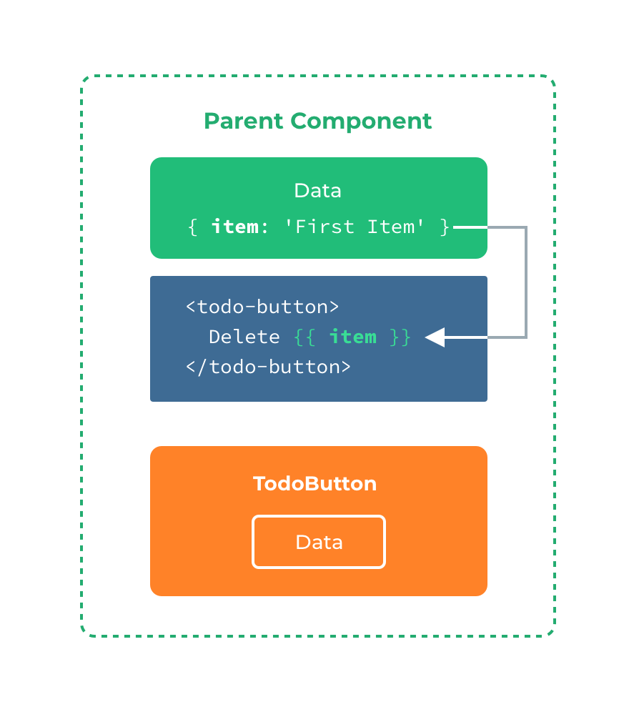
当你想在一个插槽中使用数据时,例如:
	<todo-button>
		Delete a {{ item.name }}
	</todo-button>
该插槽可以访问与模板其余部分相同的实例 property (即相同的“作用域”)。
插槽不能访问 todo-button 的作用域。例如,尝试访问 action 将不起作用:
	<todo-button action="delete">
		Clicking here will {{ action }} an item
		<!-- `action` 未被定义,因为它的内容是传递*到* <todo-button>,而不是*在* <todo-button>里定义的。  -->
	</todo-button>
作为一条规则,请记住: 父级模板里的所有内容都是在父级作用域中编译的;子模板里的所有内容都是在子作用域中编译的。
有时为一个插槽设置具体的后备 (也就是默认的) 内容是很有用的,它只会在没有提供内容的时候被渲染。例如在一个 submit-button 组件中:
	<button type="submit">
		<slot></slot>
	</button>
我们可能希望这个 button 内绝大多数情况下都渲染文本“Submit”。为了将“Submit”作为后备内容,我们可以将它放在 slot 标签内:
	<button type="submit">
		<slot>Submit</slot>
	</button>
现在当我在一个父级组件中使用 submit-button 并且不提供任何插槽内容时:
<submit-button></submit-button>
后备内容“Submit”将会被渲染:
	<button type="submit">
		Submit
	</button>
但是如果我们提供内容:
	<submit-button>
		Save
	</submit-button>
则这个提供的内容将会被渲染从而取代后备内容:
	<button type="submit">
		Save
	</button>
有时我们需要多个插槽。例如对于一个带有如下模板的 base-layout 组件:
	<!-- base-layout组件 -->
	<view class="container">
		<header>
		<!-- 我们希望把页头放这里 -->
		</header>
		<main>
		<!-- 我们希望把主要内容放这里 -->
		</main>
		<footer>
		<!-- 我们希望把页脚放这里 -->
		</footer>
	</view>
对于这样的情况,slot 元素有一个特殊的 attribute:name。这个 attribute 可以用来定义额外的插槽:
	<view class="container">
		<header>
			<slot name="header"></slot>
		</header>
		<main>
			<slot></slot>
		</main>
		<footer>
			<slot name="footer"></slot>
		</footer>
	</view>
一个不带 name 的 slot 出口会带有隐含的名字“default”。
在向具名插槽提供内容的时候,我们可以在一个 template 元素上使用 v-slot 指令,并以 v-slot 的参数的形式提供其名称:
	<template>
		<view>
		<!-- 父组件使用子组件`<base-layout>`,节点上使用v-slot特性: -->
			<base-layout>
				<template v-slot:header>
					<view>Here might be a page title</view>
				</template>
				<template v-slot:default>
					<view>A paragraph for the main content.</view>
					<view>And another one.</view>
				</template>
				<template v-slot:footer>
					<view>Here's some contact info</view>
				</template>
			</base-layout>
		</view>
	</template>
现在 template 元素中的所有内容都将会被传入相应的插槽。
渲染的 HTML 将会是:
	<div class="container">
		<header>
			<div>Here might be a page title</div>
		</header>
		<main>
			<div>A paragraph for the main content.</div>
			<div>And another one.</div>
		</main>
		<footer>
			<div>Here's some contact info</div>
		</footer>
	</div>
注意,v-slot 只能添加在 template 上 (只有一种例外情况)
跟 v-on 和 v-bind 一样,v-slot 也有缩写,即把参数之前的所有内容 (v-slot:) 替换为字符 #。例如 v-slot:header 可以被重写为 #header:
	<base-layout>
		<template #header>
			<view>Here might be a page title</view>
		</template>

		<template #default>
			<view>A paragraph for the main content.</view>
			<view>And another one.</view>
		</template>

		<template #footer>
			<view>Here's some contact info</view>
		</template>
	</base-layout>
然而,和其它指令一样,该缩写只在其有参数的时候才可用。这意味着以下语法是无效的:
	<!-- This will trigger a warning -->
	<todo-list #="{ item }">
		<i class="fas fa-check"></i>
		<view class="green">{{ item }}</view>
	</todo-list>
如果你希望使用缩写的话,你必须始终以明确插槽名取而代之:
	<todo-list #default="{ item }">
		<i class="fas fa-check"></i>
		<view class="green">{{ item }}</view>
	</todo-list>
有时让插槽内容能够访问子组件中才有的数据是很有用的。当一个组件被用来渲染一个项目数组时,这是一个常见的情况,我们希望能够自定义每个项目的渲染方式。
例如,我们有一个组件,包含 todo-items 的列表。
<template>
	<view>
		<view v-for="(item, index) in items">
        {{ item }}
      </view>
	</view>
</template>
<script>
	export default {
		data() {
			return {
				items: ['Feed a cat', 'Buy milk']
			};
		}
	}
</script>
我们可能需要替换插槽以在父组件上自定义它:
	<todo-list>
		<i class="fas fa-check">before--</i>
		<view class="green">{{ item }}</view>
	</todo-list>
但是,这是行不通的,因为只有 todo-list 组件可以访问 item,我们将从其父组件提供槽内容。
要使 item 可用于父级提供的 slot 内容,我们可以添加一个 slot 元素并将其绑定为属性:
<template>
	<view>
		<view v-for="(item, index) in items">
		   <slot :item="item"></slot>
		</view>
	</view>
</template>
<script>
	export default {
		data() {
			return {
				items: ['Feed a cat', 'Buy milk']
			}
		}
	}
</script>
绑定在 slot 元素上的 attribute 被称为插槽 prop。现在在父级作用域中,我们可以使用带值的 v-slot 来定义我们提供的插槽 prop 的名字:
<template>
	<view>
		<todo-list>
			<template v-slot:default="slotProps">
				<i class="fas fa-check"></i>
				<view class="green">{{ slotProps.item }}</view>
			</template>
		</todo-list>
	</view>
</template>
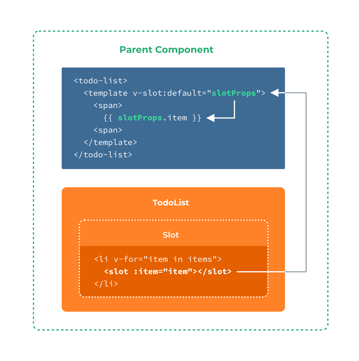
在这个例子中,我们选择将包含所有插槽 prop 的对象命名为 slotProps,但你也可以使用任意你喜欢的名字。
在上述情况下,当被提供的内容只有默认插槽时,组件的标签才可以被当作插槽的模板来使用。这样我们就可以把 v-slot 直接用在组件上:
	<todo-list v-slot:default="slotProps">
		<i class="fas fa-check"></i>
		<view class="green">{{ slotProps.item }}</view>
	</todo-list>
这种写法还可以更简单。就像假定未指明的内容对应默认插槽一样,不带参数的 v-slot 被假定对应默认插槽:
<todo-list v-slot="slotProps">
<i class="fas fa-check"></i>
<view class="green">{{ slotProps.item }}</view>
</todo-list>
注意默认插槽的缩写语法不能和具名插槽混用,因为它会导致作用域不明确:
<!-- 无效,会导致警告 -->
<todo-list v-slot="slotProps">
<todo-list v-slot:default="slotProps">
		<i class="fas fa-check"></i>
		<view class="green">{{ slotProps.item }}</view>
	</todo-list>
<template v-slot:other="otherSlotProps">
slotProps is NOT available here
</template>
</todo-list>
只要出现多个插槽,请始终为所有的插槽使用完整的基于 template 的语法:
	<todo-list>
		<template v-slot:default="slotProps">
			<i class="fas fa-check"></i>
			<view class="green">{{ slotProps.item }}</view>
		</template>

		<template v-slot:other="otherSlotProps">
			...
		</template>
	</todo-list>
作用域插槽的内部工作原理是将你的插槽内容包括在一个传入单个参数的函数里:
function (slotProps) {
  // ... 插槽内容 ...
}
这意味着 v-slot 的值实际上可以是任何能够作为函数定义中的参数的 JavaScript 表达式。你也可以使用 ES2015 解构来传入具体的插槽 prop,如下:
	<todo-list v-slot="{ item }">
		<i class="fas fa-check"></i>
		<view class="green">{{ item }}</view>
	</todo-list>
这样可以使模板更简洁,尤其是在该插槽提供了多个 prop 的时候。它同样开启了 prop 重命名等其它可能,例如将 item 重命名为 todo:
	<todo-list v-slot="{ item: todo }">
		<i class="fas fa-check"></i>
		<view class="green">{{ todo }}</view>
	</todo-list>
你甚至可以定义后备内容,用于插槽 prop 是 undefined 的情形:
	<todo-list v-slot="{ item = 'Placeholder' }">
		<i class="fas fa-check"></i>
		<view class="green">{{ item }}</view>
	</todo-list>
inline-templateX-Templateskeep-alive(App端也未支持)transition (可使用 animation 或 CSS 动画替代)在 uni-app 中以下这些作为保留关键字,不可作为组件名。
acanvascellcontentcountdowndatepickerdivelementembedheaderimageimgindicatorinputlinklistloading-indicatorloadingmarqueemetarefreshrichtextscriptscrollablescrollerselectslider-neighborsliderslotspanspinnerstylesvgswitchtabbartabheadertemplatetexttextareatimepickertransition-grouptransitionvideoviewwebTips

