
uni-app 是一个使用 Vue.js 开发所有前端应用的框架,开发者编写一套代码,可发布到iOS、Android、鸿蒙Next、Web(响应式)、以及各种小程序(微信/支付宝/百度/抖音/飞书/QQ/快手/钉钉/淘宝/京东/小红书)、快应用、鸿蒙元服务等多个平台。
DCloud公司拥有900万开发者、数百万应用、12亿手机端月活用户、数千款uni-app插件、70+微信/qq群,开发者可以放心选择。
uni-app在手,做啥都不愁。即使不跨端,uni-app也是更好的小程序开发框架(详见)、更好的App跨平台框架、更方便的H5开发框架。不管领导安排什么样的项目,你都可以快速交付,不需要转换开发思维、不需要更改开发习惯。
一套代码编到十几个平台,这不是梦想。眼见为实,扫描以下二维码,亲自体验最全面的跨平台效果!
注:
- 某些平台不能提交简单demo,故补充了一些其他功能;hello uni-app示例代码可从 github 获取 - 快应用仅支持 vivo 、oppo、华为 - 360小程序仅 windows平台支持,需要在360浏览器中打开 - uni-app 已支持纯血鸿蒙开发,详见 鸿蒙开发专题。
我们精心准备了一个简单的十分钟介绍视频,方便你快速了解uni-app的主要特征:
uni-app在开发者数量、案例、跨端抹平度、扩展灵活性、性能体验、周边生态、学习成本、开发成本等8大关键指标上拥有更强的优势。

数百万应用、uni统计月活12亿、70+微信/qq群、更高的百度指数
跨端完善度更高,真正落地的提高生产力

在跨端的同时,通过条件编译+平台特有API调用,可以优雅的为某平台写个性化代码,调用专有能力而不影响其他平台。
支持原生代码混写和原生sdk集成。


基于通用的前端技术栈,采用vue语法+微信小程序api,无额外学习成本。

不止开发成本,招聘、管理、测试各方面成本都大幅下降。
HBuilderX是高效开发神器,熟练掌握后研发效率至少翻倍(即便只开发一个平台)。
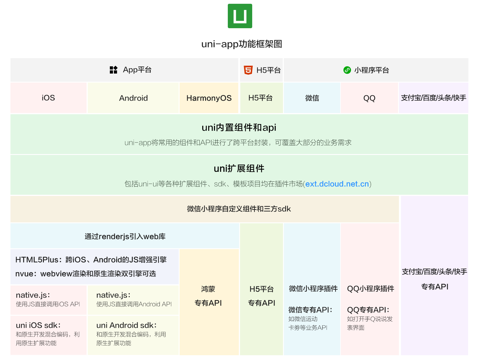
从下面uni-app功能框架图可看出,uni-app在跨平台的过程中,不牺牲平台特色,可优雅的调用平台专有能力,真正做到海纳百川、各取所长。
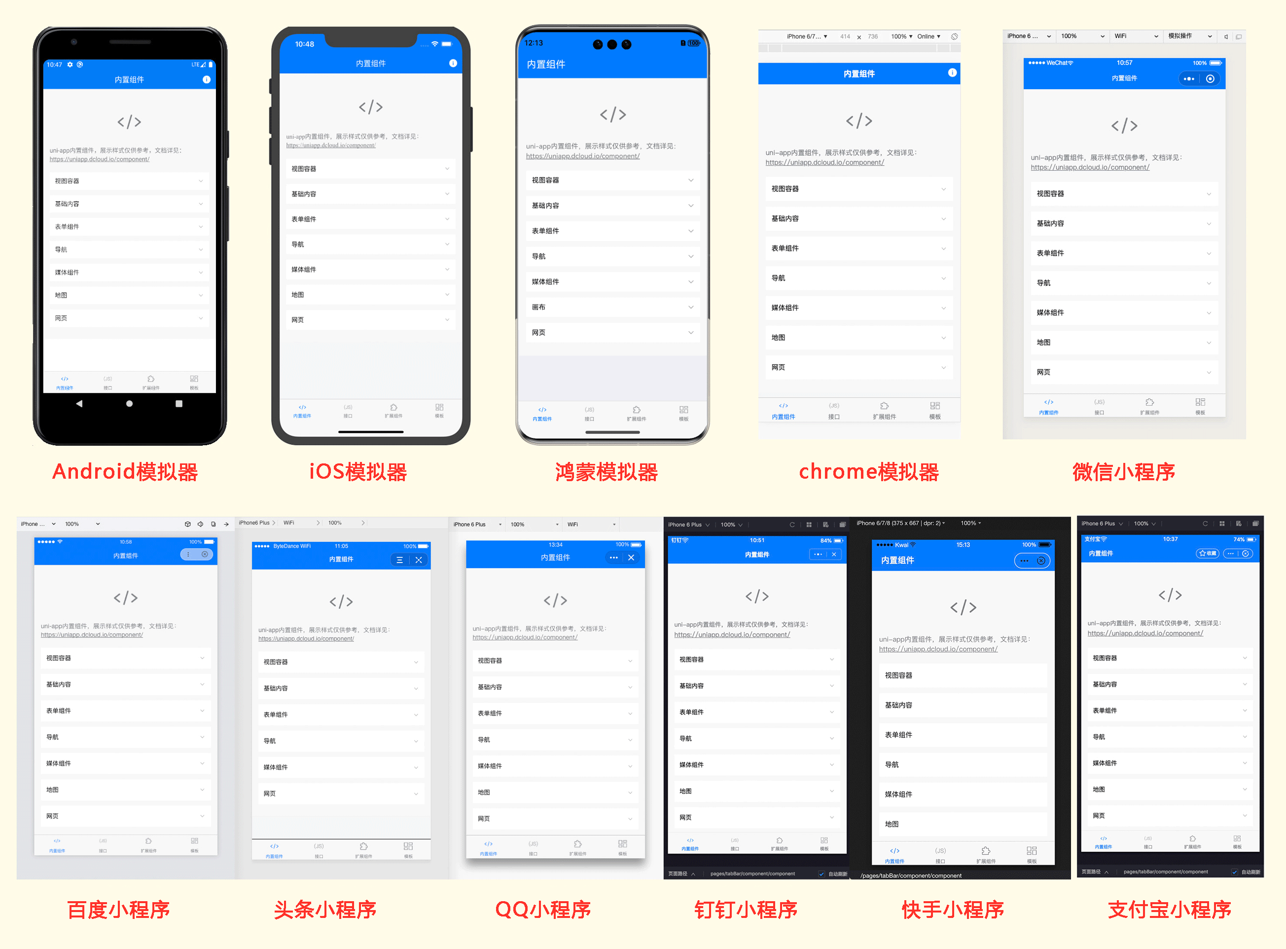
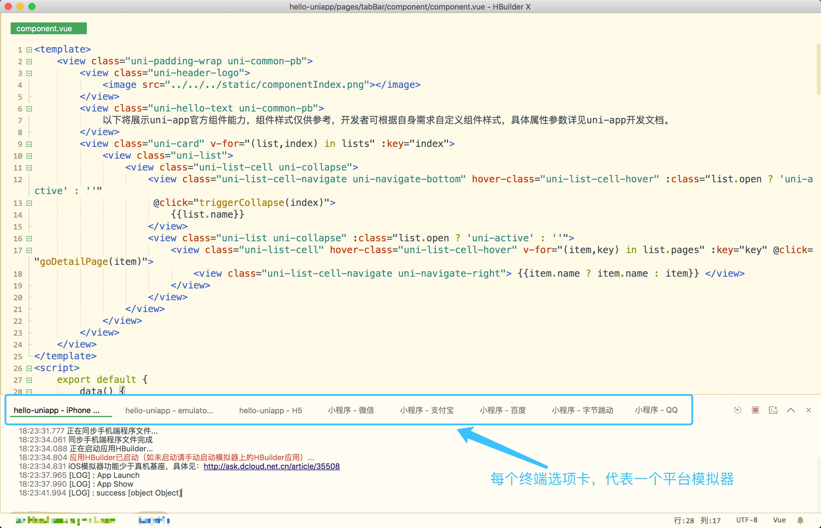
uni-app实现了一套代码,同时运行到多个平台;如下图所示,一套代码,同时运行到iOS模拟器、Android模拟器、web、微信开发者工具、支付宝小程序Studio、百度开发者工具、抖音开发者工具、QQ开发者工具(底部每个终端选项卡,代表1个终端模拟器):
实际运行效果如下(点击图片可放大):